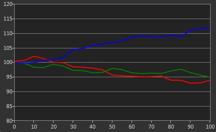

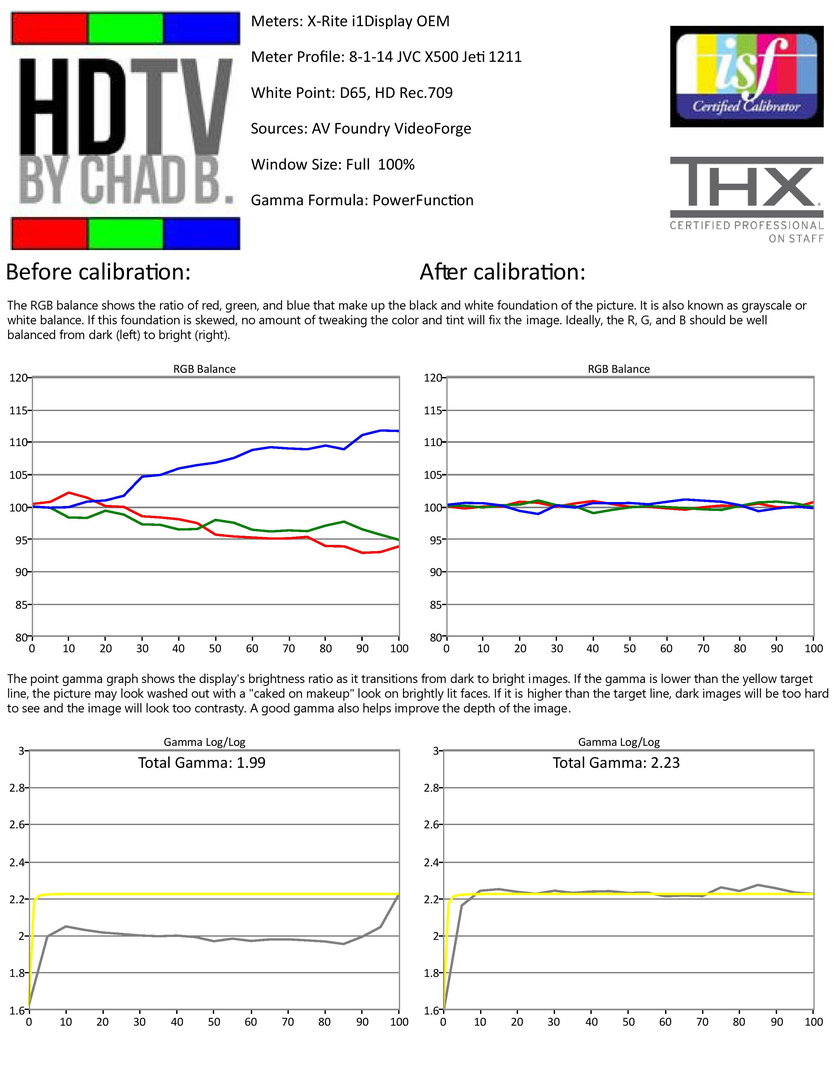
The before calibration white balance (ratio of red, green, and blue that make up white and gray) is shown above. We see that with the dark levels shown on the left side of the graph, the white balance started out somewhat reddish or violet, but as brightness increased to the right, there was an excess of blue and lack of red. At first glance one might expect this to make the picture look bluish, but in actuality it will rob the image of richness and cast a sterile, slate gray overtone over the image.
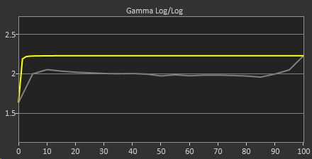
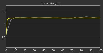
The gamma, or brightness ratio, is plotted next. If the gamma is too low at a given level, that means objects in the image at that brightness level are incorrectly boosted. On the other hand, a high gamma would indicate a lack of brightness at that level. In the result below, we see the projector's gamma measured low, which means that midtones were too bright. This caused a flattening of the image, and caused a lack of differentiation between mid tones and the brightest levels. The lack of differentiation can lead to a caked on makeup effect with brightly lit faces and a glazing over of detail in bright objects.
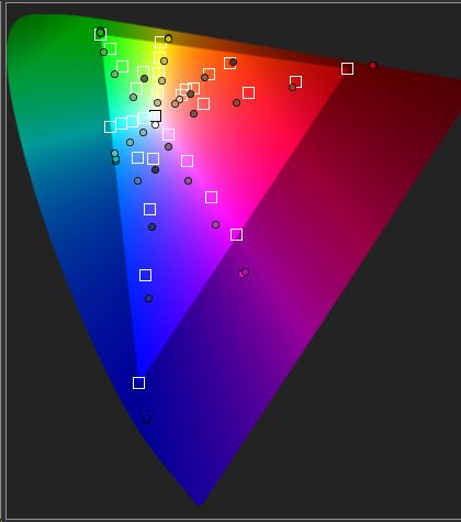
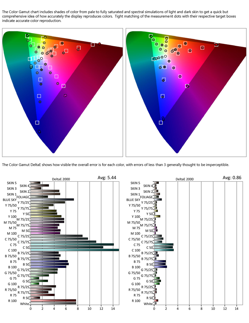
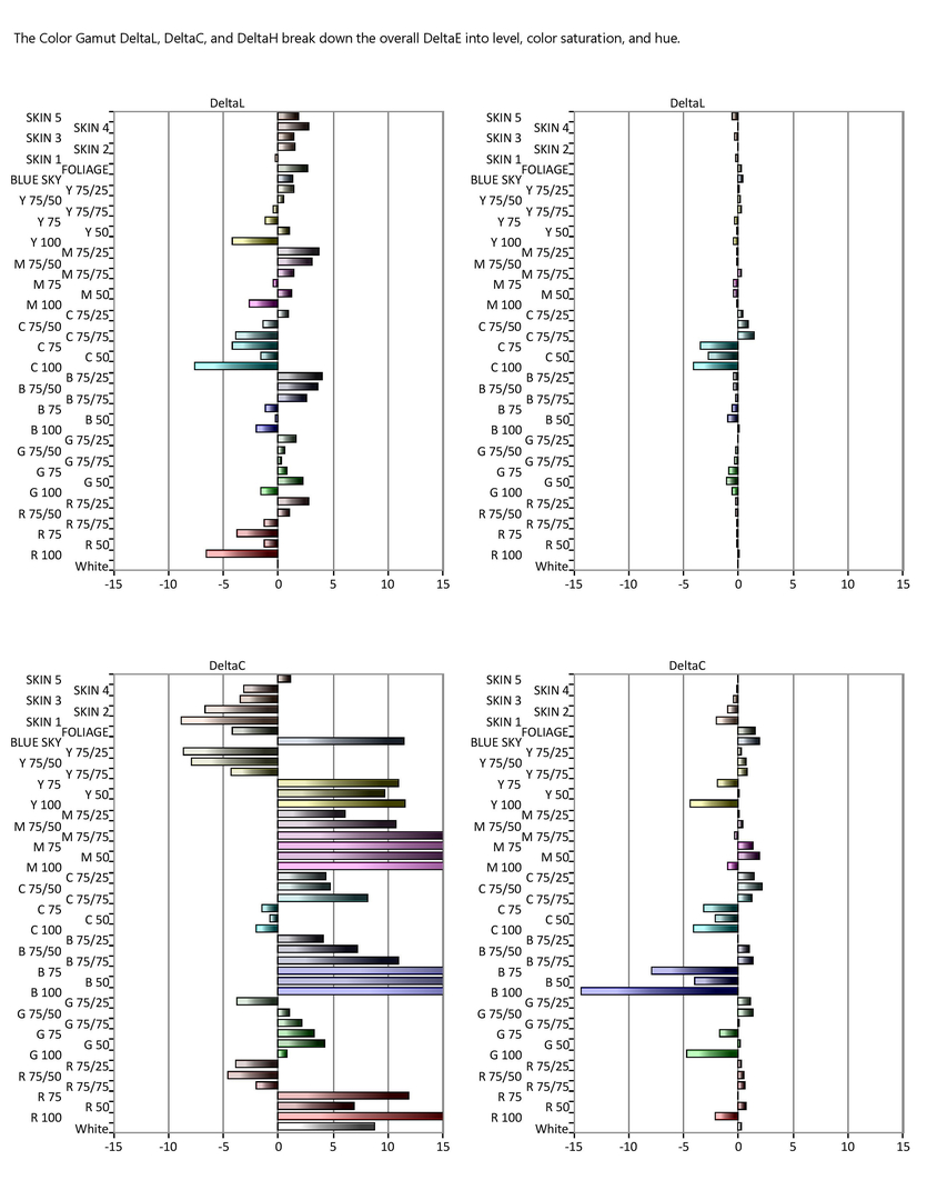
The color accuracy was measured at different brightness levels and purity (saturation) levels. Each primary and secondary color is measured with full saturation at 50, 75, and 100% brightness, and then at 25, 50, and 75% saturation at 75% brightness. There are also measurement points that approximate foliage and blue sky, and five measurements that represent skin tones. The measurements at the outer edges of the triangle are full saturation points, and the ones near the center point are the paler, less saturated shades. If a measurement, shown by a dot, is pulled to the inside of the triangle in relation to it's target box, that means it is too pale and undersaturated. The measurements showed that blue and magenta were oversaturated, which can make colors take on a "neon" or cartoonish quality. Full purity red was oversaturated, while pink shades were too pale. In addition, the skin tone cluster, located between the red and yellow, was for the most part undersaturated and pulled toward magenta, giving people a pale but slightly pink look. The paler green shades pulled toward aqua or cyan, and the blue sky point was heavily oversaturated and slightly purplish.
What happens during a front projector calibration?
Chad B uses a specially modified version of JVC Autocal software that allows the professional grade Jeti and Klein meters to be used in place of the consumer grade XRite and Spyder meters, resulting in a visibly more accurate image on all JVC projector models.
The first step is to optimize the projector mounting angle relative to the screen. If the angles do not line up properly, lens shift and keystone corrections will cause loss of resolution and geometry distortion. A pattern generator is interfaced into the system, which displays precise test patterns for all adjustments. After optimizing the shape and focus, often a significant increase in picture quality is obtained before the actual picture and color calibration is even begun.
Two meters will be set up, the first being a reference spectroradiometer pointed at the screen along the viewing axis, and the second being a fast reading colorimeter pointed either at the projector lens or the screen. The readings of the colorimeter will be profiled off that of the reference spectro, providing sensitive, repeatable, and extremely accurate measurements.
The white balance, gamma, and colors of the projector will be measured before making any adjustments to provide before calibration measurements. For illustration purposes, we will look at actual measurements of a JVC X500 DILA front projector.
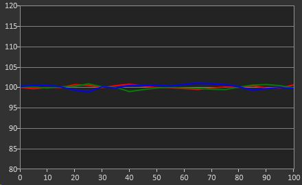
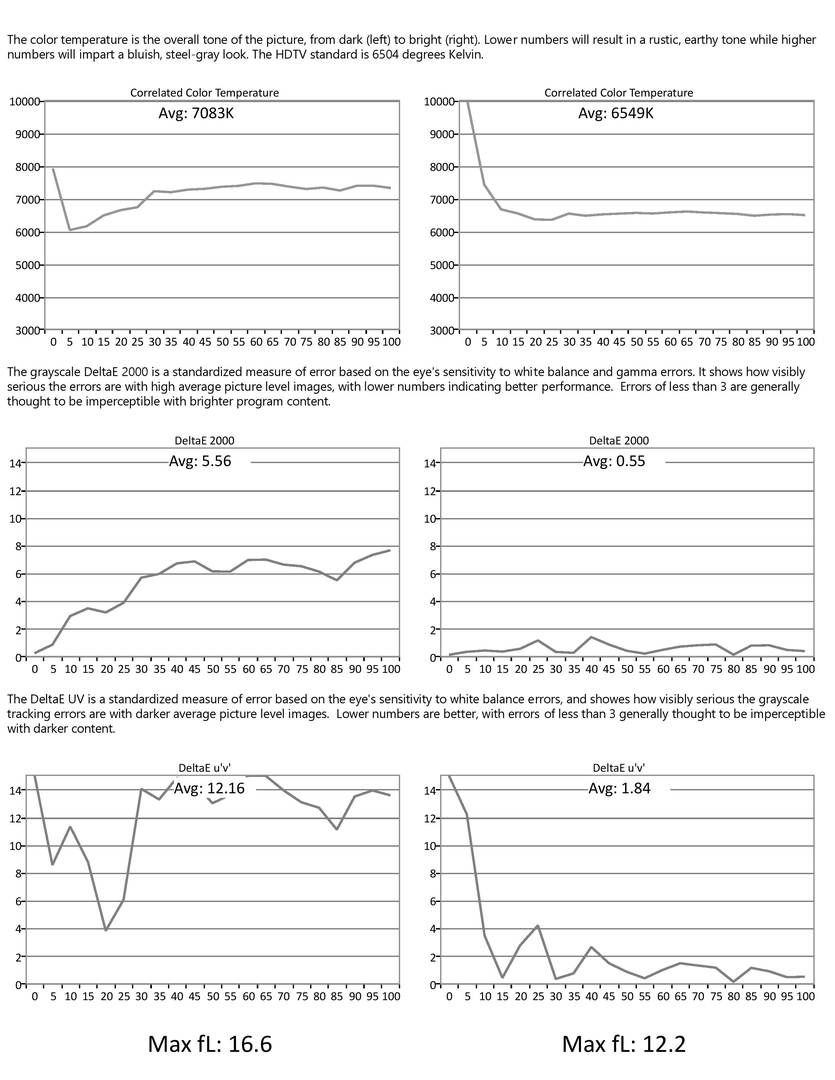
After the physical alignment was performed and the pre-calibration measurements were taken, the white balance and gamma were adjusted for accuracy at multiple brightness levels. After calibration, the white balance was dramatically improved, restoring richness and providing a neutral foundation for the picture.
HDTVbyChadB
Front projector tips:
- have total light control- any light spilling around blinds or coming through curtains will reduce contrast
- paint the walls and ceiling flat black or at least a flat, dark color- bright surfaces in the room will reflect light from the projected image itself back at the screen and greatly reduce contrast
- don't go too big for your projector- keep in mind most size recommendations are based off optimistic light output specs, and as screen size gets bigger and the lamp ages, light output goes down significantly
The gamma showed remarkable improvement, with midtones being reproduced at their correct intensities. This led to more depth, detail, and contrast perception.
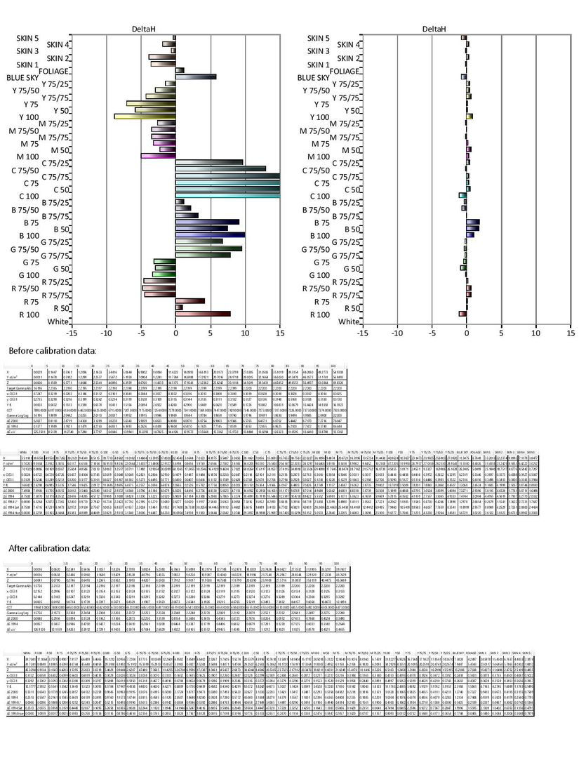
Finally, the saturation, hue, and level of each primary and secondary color was adjusted to give the best balance across the full saturation and brightness range. While some of the projector's unavoidable color tracking issues remain, the overall accuracy and balance shows significant improvement. Skin tones, grass and foliage, blue sky, and other color shades show much more realism and lifelikeness.
Here is the actual calibration report for this projector, showing the before calibration measurements and data. Each display calibration from Chad B, whether flat panel or projector, comes with a report similar to this in .PDF format. Note: Not all procedures are available or necessary on every display. Projectors should be properly mounted before calibration.
Television and projector calibration
- ISF Calibration (front projector) $700
- ISF Calibration (flat panel TV) $600
- Express Plus calibration (any display) $400
- In home colorimeter profiling $300
Why calibrate your new display?
We've all seen those movies and TV shows with a stylized “designer” look: new movies made to look old with sepia overtones or artificial film grain, the exaggerated color of CSI: Miami, colored lighting designed to give a subjective “feel” to a scene... It's what the director intended; it's part of the art of television and film.
It seems that television manufacturers have adapted similar techniques, but for very different reasons. I routinely encounter TVs with odd performance characteristics that are created in an effort to stand out from the crowd, to have brand recognition, or to make a quick and distinctive first impression. Sometimes they are disguised as a feature, as when a manufacturer boasts that their set delivers 25% deeper color saturation than what the standard calls for, though other times they're just integrated into the picture without fanfare. Too often, it's not a race to be better, but a race to be different. There are good reasons we have video standards, but those reasons get put on the back burner in an effort to mass produce TVs.
Calibration seeks to neutralize these picture editorializations, staying true to what the director intended instead of the PR department's idea of what will make a TV stand out to the masses. With the stylized look stripped away, the beauty of a natural, accurate image can shine through.
In addition, even if an attempt were made to mass produce a truly accurate display, manufacturing tolerances limit how well that can be accomplished without crippling price increases. Thankfully, there has been a move in recent years to make calibration controls more thorough and accessible, so achieving a more accurate and ultimately satisfying image is nearly always possible.
“It's not twisting the knob; it's knowing which knob to twist”
A decade ago, calibrating a TV meant getting into the secret, cryptic, and dangerous service menu. Recently those formerly guarded adjustments have been showing up in regular picture menus, making them accessible to everyone. So why pay a pro to come out and adjust your TV when the controls needed are often there for anyone to adjust?
Calibration is both science and art: taking objective measurements, using them to align the picture to established standards, and doing it all in a way that compliments the viewing environment and the viewer's tastes. The scientific side demands sophisticated and accurate test equipment and software; and the artistic side requires experience, a good eye, and sensitivity to customer's needs and desires. In addition, there are compromises and judgment calls that cannot always be decided on a purely scientific basis. It's not a matter of “adjust color control to change brilliance of picture color,” or “adjust gamma control for more pleasing brightness characteristics.” It's using a meter to measure just how your display reproduces the incoming signal, and making corrections necessary for the most accurate, and ultimately most enjoyable picture possible.
Every aspect of video performance is optimized to the fullest extent in Chad B's ISF calibration, and no stone is left unturned. It typically includes day, night, HDR, Dolby Vision, and 3D modes, though that depends on your display and wishes. The level of precision and measurement throughness exceeds industry standards and expectations. It can be an interactive process, with full explanations of what's being adjusted and why. It doesn't matter how complex your system is, it will get the absolute best from your display!
The Express Plus calibration is meant for either budget displays or for displays with limited calibration controls. It has a time goal of under two hours, and includes all calibration procedures that can be expected to fall within that guideline. Distractions and interactions should be minimized to keep the calibration procedure efficient. If the ISF calibration doesn't make financial sense or if your display has only simple calibration adjustments, the Express Plus could allow you to see your TV at it's best with minimal investment.
In home colorimeter profiling is offered to customers who own a meter and love do do their own calibration with CalMAN or HCFR. Colorimeters of all types, from inexpensive consumer grade to expensive pro models, benefit from calibration by a reference spectroradiometer on each individual display it is used with. With this service, Chad B's Jeti 1211 spectroradiometer will be used to profile the customer's colorimeter on up to 2 displays per household.

Copyright © HDTVbyChadB. All Right Reserved.